Ayna
Easing Online Shopping Experience
Responsive website design

Overview
Ayna is a successful offline clothing business across Canada. It offers trendy clothing and accessories for men and women and customers enjoys in-store shopping here.
It is a clothing store targeting a budget-minded audience who looked for low-cost clothing for any occasion. The quality is pretty good and the prices are rather low. Their main goal is to make any type of clothing accessible to everyone. They believe clothing doesn’t have to be expensive and last forever--that we should be able to change styles as we need and please.
Role
User Research, UX/UI Design, Branding
Prototyping, Usability Test
Timeline
80 hours
Tools
Figma, Whimsical, Adobe Illustrator
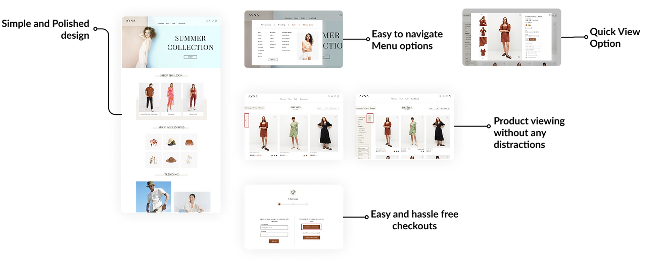
Solution Overview
Challenge
Online shopping is increasing significantly, especially after Covid. Ayna is lacking it’s online presence and wants to enter the digital world which offers smooth customer experience.
How to regain Ayna's customer base and make a remarkable re-entry in the market which offers seamless shopping experience to its customer?
Solution
Designing a responsive e-commerce website which offers clothing to customers at their convenience and stands out from the competitors. Rebranding Ayna's image which incorporates with the modern world will ensure a successful re-entry of Ayna in the market.
Conducting Research
Knowing the competitors
Knowing the fact that pandamic has forced physical stores to enter the digital market, there has been a rise in competition in online sector and in order to stand out from the crowd it is important to know what customers enjoys and what distract them from having a pleasurable user experience. I did competetive study on major brands which helped me analyze their weak points and their strengths. The study helped me make decisions moving forward.

Competitive Analysis
Findings
After studying major competitors, I can say that all have online and offline presence and are going strong in their own ways but they also have their weaknesses at some point.
With the help of this research, I outlined some important things that an ecommerce site should consider to make constomer satisfied with their experience.
• A well designed landing page
• Easy and accessible navigation
• Product saving/Wishlisting feature
• Product filters including size, prize, color, reviews
• Proper layouting of products for better view
• Early access to new collection
• Quick checkouts
• Hassle-free returns
Understanding Users
I interviewed four participants between the age group of 20-35 yrs.
All users shops online and offline. Their ultimate goal is to look for clothes that are affordable, good quality and well-fitted which are easy to buy and return if not liked.
Needs
-
Product should not be misleading
-
Accurate and correct size information
-
Visibility of products which are low in stock
-
Customer review with images
-
Easy navigation to product category
-
Easy and quick checkouts
-
Visualizing product on them with the help of AR feature
-
Easy returns and exchange of products
-
Images based product recommendations
-
Final sale products
Frustrations
-
Finding products based on their size.
-
The keyword search option is not useful most of the time. What they are looking for is totally different from what is shown.
-
Difficult to search for a particular category of product from the category section.
-
Lengthy checkouts
-
Hard to find the returns and exchange page.
Define
User Persona & Empathy Map
With the gathered information I was able to define and create a user persona that will be a potential user of Ayna's products. Meet Gloria a young professional and a mindful shopper. Keeping in mind of Gloria's needs and frustrations, the persona guided me make design decisions further. Empathy map was created to gaing more insights into Gloria's behavioural patterns.


Project Goals
With the help of research findings and reviewing project brief I created project goals considering different aspects of the business. It gave more clarity and helped me consider features list based on different goals.

Feature Roadmap
Based on the level of importance I created a Feature roadmap which includes some of the needed functionality added to must have category whereas something that requires time and resources can be added later. Having a features list prior to designing ease the process further.
Ideate
Card Sorting
I completed open card sorting with 5 participants through optimal sort with 20 different cards to know how users group and organize items in different categories.
Participants created a total of 28 categories, with a median of 6 categories each. Overall study showed, participants were able to create 3 groups with 80% agreement for tops, bottoms, and jackets/blazer.
Site Map
After defining potential user and project goals, a site map was created giving structure to the project. I decided to not overcrowd information and keep it straight to the point.
.png)
Task Flow and User Flow
I first created a quick task flow which is more universal and any kind of user would go through.
After that a detailed user flow was created considering user persona Gloria. The below user flow showcases the journey of Gloria where she saw a pair of jeans on Instagram and ends up buying them. By noting the steps taken, it was easier to understand what functionality and features I would need to integrate into the website.
.png)
Sketching and Wireframes
I began by sketching out different options for homepage until I got to the point where I was satisfied with my designs. I then digitized sketches and created wireframes for all the needed pages.


Branding and UI Kit
Finally coming to the design phase, I first created a mood board that involved a sense of styles and colors that I was visualizing.
I then created a logo which represents the brand message as trustworthy and modern. Other branding elements like colors, typography, products image style were also created. Having a style tile and UI kit beforehand helped to keep the design of entire website to be consistent which makes it look more professional and easy to understand.


Hi-Fidelity Designs
Out of all research, mid-fi wireframes and branding I created responsive Hi-fidelity designs of the needed pages.


Prototype & Test
Prototype
I prototyped high-fidelity designed pages and with the help of user flow, I connected those pages and linked them together to which my persona would interact with to complete the task. Prototyping the design helped me validate it in the testing phase.
Usability Test
All pages were ready at this point to be tested. A Usability test was done to examine users success rate on completion of the given task and to identify areas of improvement by getting feedback and asking questions with regards to their overall experience.
Remote Test was done with 5 participants. I gave users with a task to buy a dress and try some features along the way. After completion of the task I asked users some follow up questions to know their experience while using the product.
Usability Test Findings
.png)
Usability Test Findings
All users were able to complete the task and mentioned that the site was easy to navigate and they liked the overall branding of the website. Although they were able to complete the task but got confused on the shipping and details page as they mentioned the interaction was not easy to understand while entering details in the checkout process.
Priority Revisions
I decided to makes changes where users got confused and also considered some of the feedback users suggested which totally makes sense as priority revisions,
-
Added an overlay page which will open when clicked on review order.
-
Highlighted arrow for hiding categories in products page
-
Added low in stock information besides product name and icon as well.
-
Images can be seen in product reviews

Reflection
Overall the design was a success since all users were able to complete the task. There were some confusions which I believe will be avoided with the changes made in priority revisions.
Being my first project from research to design, I think the end results were quite satisfying. Due to time constraints, I have to limit user interviews and testing to a certain number of users. Some of the needs of users were not being addressed at this point as being a solo designer the advanced functionality and features are needed to be discussed with the development team which limited my scope.
Other Case Studies
Unify
Instacart


Toronto Transit Commision