

Background
Instacart is the leading online grocery platform in North America. Instacart's shoppers offer same-day delivery and pickup services to bring fresh groceries and everyday essentials to busy people and families across the U.S. and Canada. Instacart’s delivery service is available to over 85% of U.S. households and 70% of Canadian households.
For continued growth, the added subscription feature will increase the customer retention rate and will also expand its customer base. The feature will also help a specific group ex. people needing medical supplements on a regular basis. It is intended to save time and let customers not worry about their supplies getting over.
Role
Research
UI/UX Designer
Prototyping
User Testing
Timeline
5 Weeks
Tools
Figma, Maze
Problem
Online grocery delivery services has been on the rise especially more after Covid-19. Most people have avoided going in-store and rather shop online. This brings an opportunity to retain this customers by providing them with a new feature that will ease their ordering process.
Users are not able to schedule orders ahead of one week and having to go through whole process every time is a pain.
Solution
-
A feature enabling users to schedule orders after every certain days to get delivered frequently.
-
Introducing a feature where users can create their grocery list and categorize them for easy ordering.
How might we ease the buying process which will eliminate the task of frequent ordering to give what users needed without them having to order repeatedly ?
-
Research
A look at the competitors
I first started of by knowing the competitors and learned about their strength and weaknesses. I learned that what might separate a product from other competitors can be the addition of subscription service feature. There are only few competitors that offers these services but not widely available. By filling these gap in the market the new feature will help the business grow and retain its customers.
Through this study, I was also able to understand that there are several factors for the success of grocery delivery services and mostly all competitors brands are doing well in this sector by providing services like,
-
Quick and Fast Delivery
-
Quality Products
-
Products Details with relevant information
-
Good Customer Service
-
Competetive Pricing
-
Intuitive Design

Empathizing with users
After doing competitive analysis, I wanted to validate the concept with the users and also know more about there needs and frustrations. In order to do so I conducted 1-1 interview with five participants who buys grocery online.
All users showed interest and mentioned they would like to see this feature and they see themselves using it frequently. However, they expressed some concerns regarding it.

"Will I be able to modify the scheduled deliveries? "
"Will there be any minimum order requirement for the order?"
"Can I make changes to the day/date they need order or it will be fixed day for each?"
"Any extra fees I will have to pay for the subscription service feature?"
"What happens if their items are not in stock? Will I get a replacement or no item?"
Knowing the concerns of the users, I brainstormed and came to the solution to users concerns regarding the new feature. I noted some of the key factors to consider. By knowing their needs, I also considered to add my grocery list features and adding product description section in products details page.
Ability to modify order including changes in item and they day of delivery
Option to replace item incase something is out of stock
Notification prior to delivery day
Options to chat live with shopper and contactless service
With the help of insights from user interview and competitive analysis, I created a persona which helped me make design decisions further in the process.

Getting to know personas better
Keeping a scenario in mind I created user journey map of Haylie's overall experience using the app considering what her emotions and actions she takes while during the whole ordering process.
User journey map helped me know the areas of focus and gave a better understanding on placement of new feature.

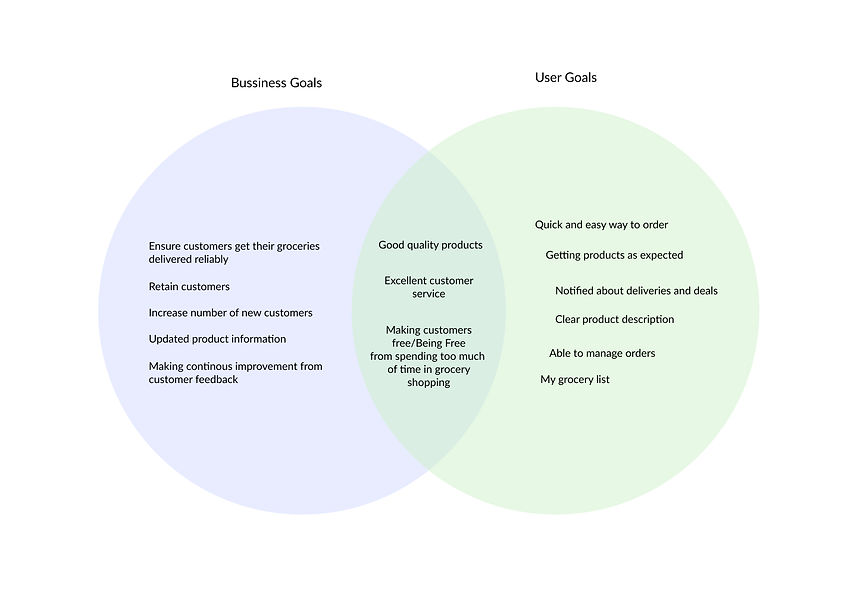
Project Goals
To have more clarity and consider business and user goals, I created Venn Diagram from which it is easily understood that some of the business and user goals are in the same direction for which it is important to put more emphasis on those.
How do we make users spend less time on Grocery shopping?
-
Define
Meet Haylie
-
Ideate
Time to organize
Since I myself being an instacart user I knew how the app works and I also went through it to know about the structure of information. My goal for creating an app site map was to seamlessly integrate new features which users can easily look for.

User Flows
For a deeper understading and the area of focus I created user flows to know users actions and pages she would interact with. It gave me more clarity and prepared myself for the sketching process.

Mid - Fi Wireframes
With the help of task flow and app site map, I created wireframes for different tasks and features. This was one of the most important and challenging process as I wanted to make sure that the addition of new features integrates with the existing design patterns without making any major changes to the existing design.
-
Prototype and Test
Hi-Fi Designs &
Prototype
After sketching out the designs for new feature, high fidelity design were created. With the help of instacart's existing branding, I was able to create final designs.


Usability Test
I did usability test with remotely via zoom and maze. In total eight participants did the test.
Three tasks were given,
-
Adding items and selecting a schedule to get delivered frequently.
-
Confirming order scheduling.
-
Adding items to the personal grocery list and creating categories.
Usability Test Results
I created affinity map to find out the success rate and what changes I’ll need to make based on priority.

Success
-
6 of 8 of participants were able to complete all the three tasks.
-
Would like to see new features coming live.
-
Scheduling icon is easy to understand.
-
Given three options for scheduling can cover the majority of people's needs.
-
Icons match with the existing app style.
Painpoints

-
2 of 8 participants were unable to complete the first task and gave up.
-
3 of 8 participants had confusion in the cart page.
-
4 of 8 participants got confused in the last task. Didn’t understand what needs to be done after creating the category.
-
CTA was not clear on the cart page.
-
Hidden CTA for pending order confirmation.
-
Interaction after adding items to cart from category was not visible and did not understand if the task was done.
Iterations
-
Changes in the order scheduling page so that everything is easy to understand.
-
Making the interaction after selecting the scheduling time more noticeable.
-
Making changes in the cart page to avoid confusion.
-
Adding a page after creating a category and giving instruction so that user can know what needs to be done.
Revisions
Before
After

Changed colors to integrate with existing design system and also made interaction more noticeable.
Before
After
Before
After
Made changes in color as user's existing users don't recognize yellow in the app. also added iconography soo that users don't get confused.
• Interaction was missing, added a page after creating category which will let user know that it is created and then adding items to it.
Before
After
Final Thoughts
It was fun and challenging to design a feature that integrates with existing branding with time constraint. One thing I would do differently is to test early and if I had given the freedom of time I would like to do at least two usability test sessions before handing over designs to developer.
The project helped me understand the balance between research and design. For this particular project I learned that putting more emphasis on research will bring a better opportunity to add a feature that user enjoy using.
Other Case Studies
Unify


Toronto Transit Commision

Ayna